Here’s a plot of Covid-19’s reproductive rate () over time in the UK, based on daily case numbers and seroprevalence surveys. Because the estimates are uncertain, each light blue line on the plot shows a possible path that could have taken, with all paths together giving a sense of what’s plausible on any given day.
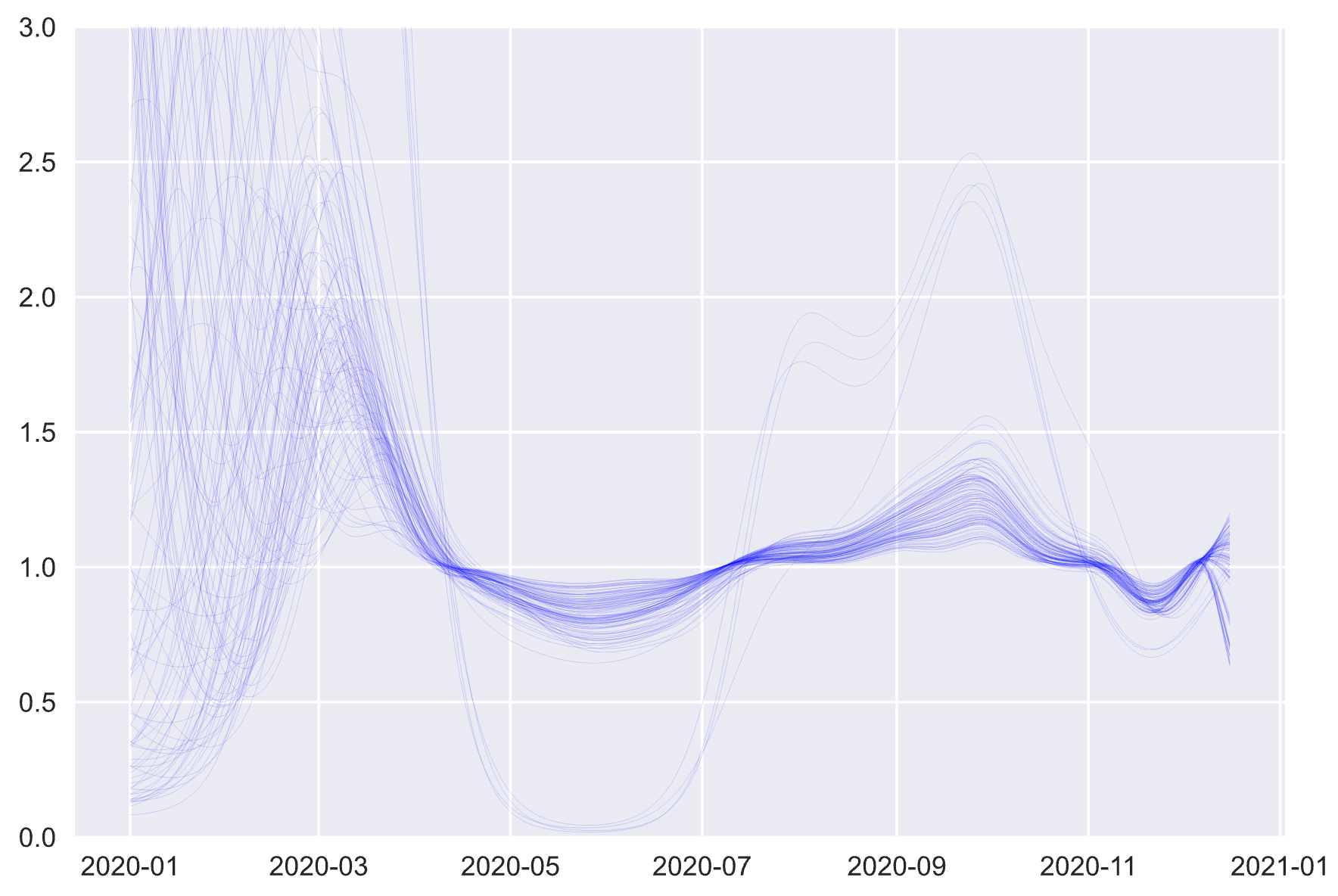
Early in the year could be almost anything, given the limited data at that time. As testing improves, the effects of the first, stringent lockdown in late March become clear, with rapidly dropping below one. Things loosen up for the summer, but drops once again when lockdowns are imposed for a second time at the start of November.
The reproductive rate is probably familiar by now, but the way it’s calculated here may not be.
Yes, SIR
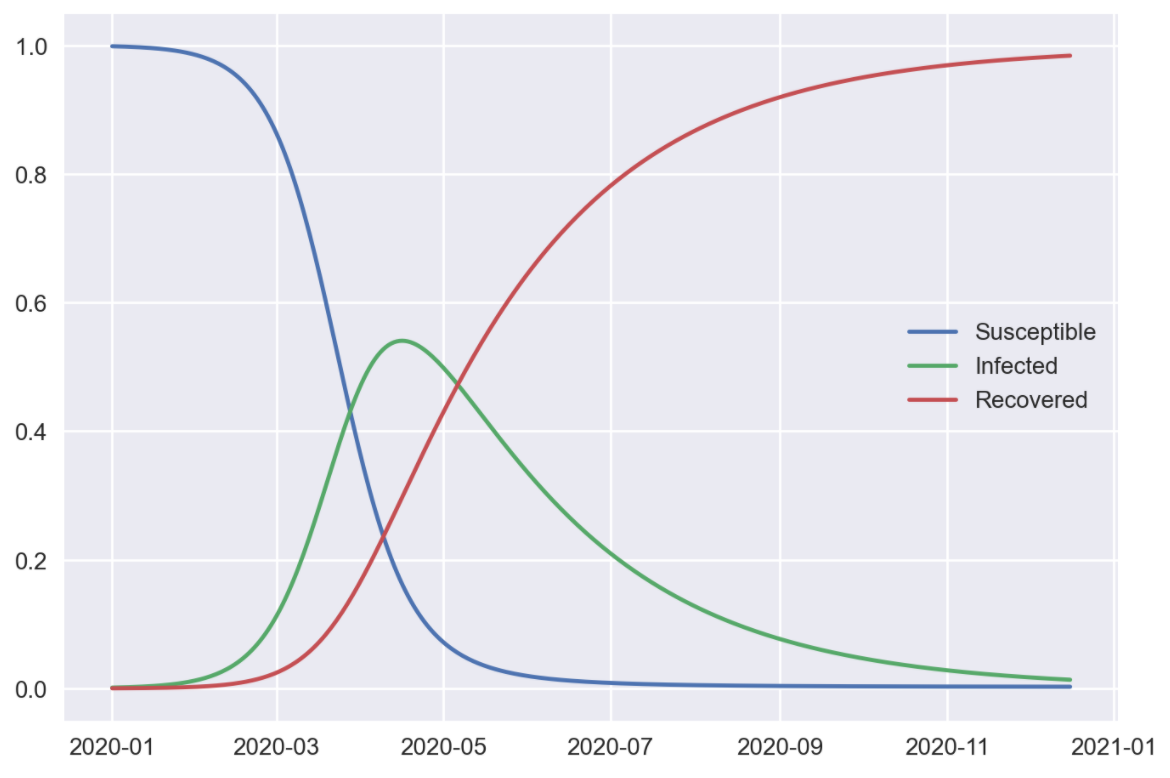
A cornerstone of infectious disease epidemiology is the compartmental model, in which a population is divided into buckets. Each bucket counts the number of people at a different stage of a disease, and over time there is a flow between buckets (as, for example, infected people recover). The simplest compartmental model is known as the “SIR model”, defined by the following equations.
These represent three buckets, for those who are susceptible to a new disease (labelled ), currently infected by it () and recovered from it (). Over time new people become infected (moving from to ) and recover (moving from to ). The two key parameters are , which represents how easily the disease is transmitted, and , how quickly those infected recover. We can also represent transmissibility with the familiar reproductive number , which in this setup is given by . (Somewhat confusingly, and are unrelated here.)
If we solve these equations we’ll end up with a plot of the disease’s course like this.
The SIR model and friends are useful in epidemiology, despite being heavily simplified. But one issue makes them hard to apply to covid case counts: the assumption that the rate of transmission (and hence ) doesn’t change over time. In many countries, lockdowns and circuit breakers are intended to change the transmission rate. Some regions have even seen multiple peaks in case counts as lockdowns are imposed and eased again, behaviour that the SIR model alone can’t account for.
So in practice we need to distinguish between the baseline reproductive rate, , at the start of the epidemic and before any behaviour changes, and the effective reproductive rate . also has the useful property that it measures whether infection rates are increasing; if the epidemic is getting worse, while at the disease dies away.
Every day I’m modelling
The plot above takes the SIR model as a foundation, but switches out the constant for a variable that can change over time, and from which we can derive .[1] We don’t know what is, but we can make a guess for it (as well as other important parameters like ). We can then simulate an epidemic using these guesses, generate simulated case and death count data, and compare it to the counts we actually recorded in a given country. If the simulation looks like the real data, our guess for was good, and we’ll keep it; if not, we’ll throw it out. The plots above show the remaining, plausible values of . Made a bit more formal, this process is called Bayesian inference.
From this we get estimates of transmission over time, which gives us a nice indicator of how effective lockdowns are. A time series allows us to make use of all the data while still being responsive as new information comes in. For example, it’s quite likely that is already edging above as students return and families move around for Christmas, yet as of writing the goverment reports a below-one figure from a few weeks ago.[2]
Combining modelling approaches this way has other advantages. Including the dynamics of disease spread allows us to make sense of rich but complex and non-linear data, and relate very different datasets together. Estimating important parameters together helps to understand relationships between them (eg “if was low in June it must have been high in October”). For all these reasons epidemiologists often work with mechanistic or multivariate models.
If you want to play around with it, you can find the code for all this on GitHub.
More technically, is modelled as a Gaussian process. For our purposes this is basically a fancy moving average, which accounts for uncertainty and can be smart about how smooth the resulting curve is. ↩︎
Update: A couple of days after this plot (the 18th), the official figure was updated to be 1.1-1.2. ↩︎